
The Australian sharemarket has struggled to match the performance of global peers in recent years. While a number of theories have been put forward to explain our relatively poor returns, this note suggests two factors tend to dominate: trends in export commodity prices and the health of the global technology sector. On this basis, it seems likely our market could struggle against global peers for some time yet.
Recent Australian relative equity performance
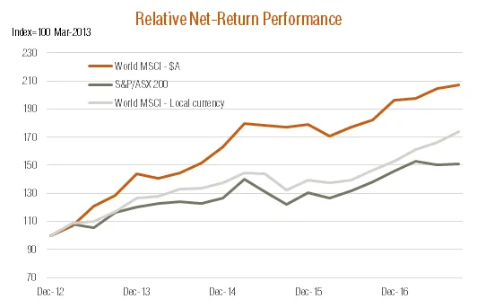
Australian equities have tended to underperform the global benchmark in recent years, though the degree of underperformance does depend on how returns are measured.
On a pure price basis (i.e. before dividends), the S&P/ASX 200 Index since end-2012 has produced annualised gains of only 4.3% p.a. (to end-September), compared with 10.1% p.a. for the MSCI All-Country World Index on a local currency basis. Allowing for the fact Australian companies pay higher dividends, however, the difference in total returns is not as great – with total returns for the local market of 9.1% p.a. compared to 12.3% p.a. for the global benchmark. Allowing for franking credits on Australian dividends would further narrow this gap on a comparable gross or “pre-tax” basis.
That said, it’s traditional to benchmark local equity returns against unhedged $A returns from global markets – and on this basis, the difference again widens due to the decline in the $A in recent years. Indeed, over this period, for example, the $A has fallen from $US1.03 to US78c. Accordingly, in $A terms, the MSCI All-Country Index has delivered stronger price and total return gains over this period of 14.8% p.a. and 16.6% p.a. respectively.
Source: Bloomberg. Past performance is not an indicator of future performance
What drives Australian relative performance?
Two distinguishing characteristics of the Australian market appear to largely account for its relative performance over time.
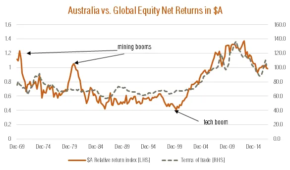
First and foremost is the market’s relatively large exposure to mining companies, and hence sensitivity to the price of Australian exports (i.e. commodity prices). As seen in the chart below, the Australian market tended to broadly track global performance over the 1970s to 1990s – when the terms of trade (price of Australian exports relative to imports) was also relatively stable. Australia then enjoyed a strong period of outperformance when the terms of trade surged during the commodities boom, though part of this outperformance has since been unwound as the terms of trade declined. Even more recently, Australia enjoyed a brief period of outperformance over the 2015/16 financial year due to the iron ore driven rebound in the terms of trade.
Source: Bloomberg. Past performance is not an indicator of future performance. Net $A return indices for the Australian S&P/ASX 200 and MSCI All-Country World Index respectively.
Two factors account for this strong relationship. First, a rising terms of trade tends to boost Australian corporate earnings (through the mining sector), which in turns helps Australian equity performance on a local currency (or currency-hedged) basis – and vice versa.
On top of this, a rising terms of trade also tends to push up the $A, which in turn reduces the unhedged $A returns for Australian investors from international markets – i.e. supports Australian equity outperformance on a unhedged $A basis – and vice versa.
Also evident in the above charts are two periods when Australia experienced a strong spurt of outperformance even though the terms of trade hardly moved – in both the early 1970s and early 1980s. This appears to have reflected a speculative surge in mining sector prices based on commodity booms which never really materialised to the degree hoped.
A second factor that appears to help explain Australian relative performance is the popularity of the global technology sector – especially given Australia’s relatively low weight to this sector. As seen in the charts above, Australia also tended to underperform in the late 1990s – even though the terms of trade were broadly stable – which coincided with the strong price performance of the global technology sector. The Australian market then unwound this underperformance as global tech stocks subsequently declined.
Where to from here?
Against this backdrop, it begs the question how the Australian market is likely to perform over the next year or so. The answer would seem relatively straight forward – if you expect commodity prices to continue to edge down rather than up and for the global tech sector to continue to outperform (as I do) – then it would suggest the Australian market is also likely to underperform relative to global stockmarkets.
QuietGrowth has been publishing content in this blog or in other sections of the website. Contributors for this content may include the employees of QuietGrowth, or third-party firms, or third-party authors. Unless otherwise noted, such content does not necessarily represent the actual views or opinions of QuietGrowth or any of its employees, directors, or officers.
Any links provided in our website to other websites are for the purpose of convenience, or as required by any such other websites. Unless otherwise noted, this does not imply that QuietGrowth endorses, is affiliated, and/or promotes any information, or products or services of those websites. Please read the advice disclaimer section of the website too.