
The rise in global equity prices in recent years has led to continued concerns over valuation levels. One indicator that appears to cause endless nervousness is the so-called “Shiller” PE ratio, which considers US stock prices relative to the rolling 10-year average level of earnings. As this note demonstrates, however, the Shiller PE ratio has proven to be a poor short-run market timing tool. And while it has proven to be a reasonable guide for likely longer-run returns in the past, allowance today needs to be made for the large structural decline in interest rates.
The Shiller PE Ratio is high
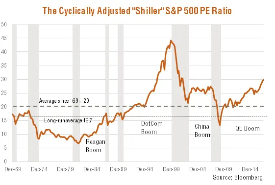
Made famous by Nobel-prize winning economics professor Robert Shiller, the so-called “Shiller” or “cyclically adjusted” PE ratio (SPER) compares the level of US share prices to the 10-year moving average level of earnings.
The indicator has proven popular in recent decades, after Shiller used the analysis during the dotcom bubble period to suggest the market was overvalued and lower returns could be expected over coming years – he was eventually proven right!
As seen in the chart below, the current level of the SPER is around 30, which is above its average since the 1880s of 16.7. The SPER is higher than during the peak of the late-1960s bull market, and close to the level in 1929 (32.5), but still well below the peak of 44.2 in 1999.
Shiller PE Ratio: 1880 to 2017
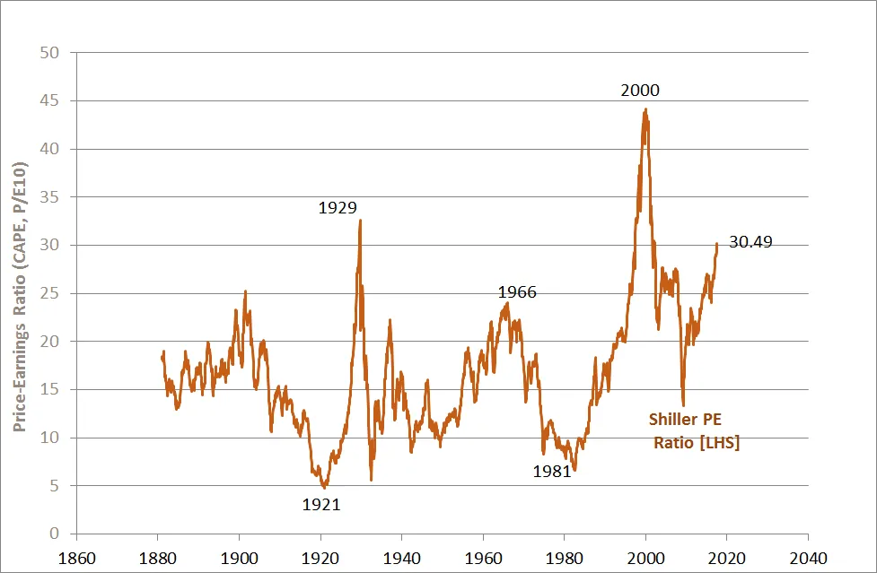
Source: Prof. Shiller, Yale University
But it’s not a great market timing tool
Does this mean the market is about to crash? As seen in the chart below, the SPER has tended to be above average for the much of the past two decades. Indeed, it continued to rise for an extended period through the late 1990s bull market, and hovered above 25 for most of the commodity-driven bull market prior to the financial crisis. As a short-run market timing tool, the SPER has not been much help!
The longer-run outlook for stocks is potentially more sobering
The SPER has had better success as an indicator of longer-run likely returns. As seen in the chart below, relatively high levels of the SPER have tended to be associated with relatively low real share price returns over the following 10-year period. Indeed, the last three times the SPER hit 30 (back in the late 1920s and again twice during the dotcom bust), subsequent 10-year real share prices returns were negative. That does not bode well for likely US share price returns over the coming decade!
Shiller PE Ratio and Subsequent 10-year Real Share Price Returns
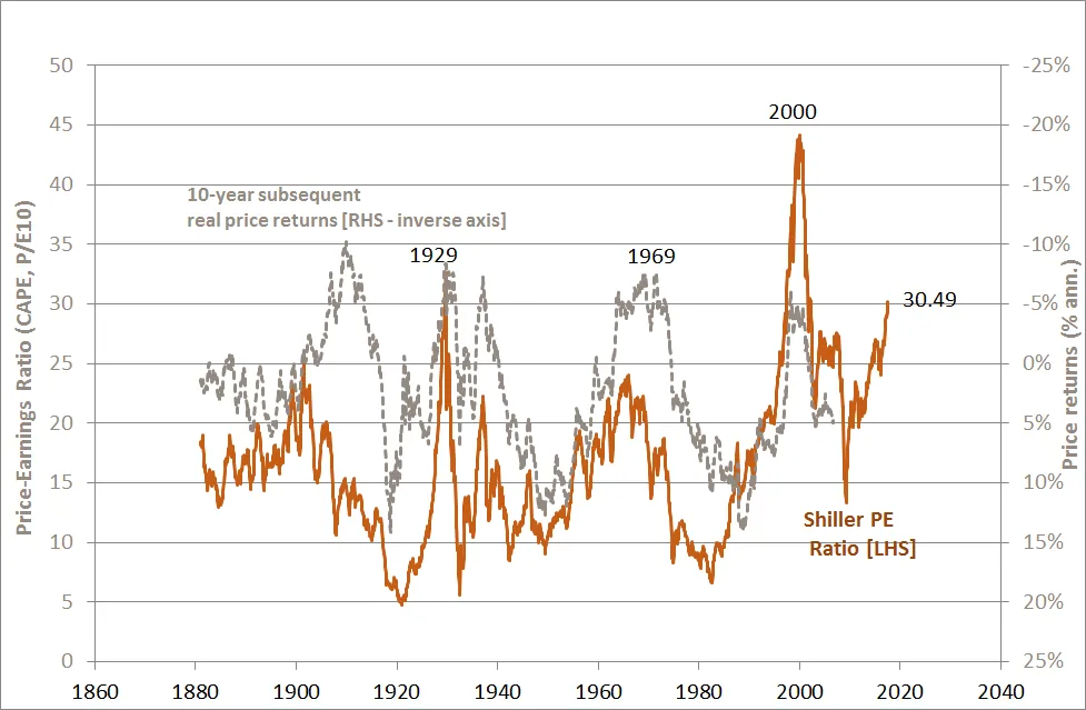
Source: Prof. Shiller, Yale University
That said, one complicating factor in extrapolating past historical patterns is the huge cycle in interest rates that has been experienced over the past 50 years. As seen in the chart below, equity markets faced the headwind of rising interest rates from the 1960s to the early 1980s, only to then enjoy the tailwind of falling rates for the past 35 years.
Real US 10-Year Bond Yields (nominal yield deflated by 10-year rolling average CPI inflation
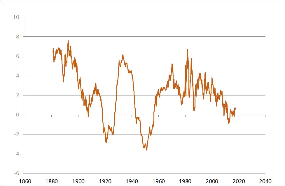
Source: Prof. Shiller, Yale University
As seen in the chart below, if we invert the SPER to generate a “Shiller earnings yield” and compare this to real bond yields from the chart above, current equity market valuations then appear less troublesome. Indeed, the Shiller earnings-to-bond yield gap is currently around 2.7%, compared with a long-run average (since the late 1880s) of 4.7%. Note, moreover, past periods of particularly weak 10-year real share returns (in 1929, 1966 and 2000) were associated with earnings to bond yield gaps closer to zero.
Shiller Earnings to Real-Bond-Yield Gap and Subsequent 10-year Real Share Price Returns
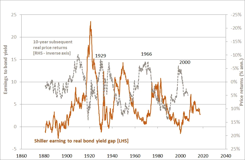
Certainly compared to 1929, 1966 and 2000, this method of stock market valuation is not flashing red.
QuietGrowth has been publishing content in this blog or in other sections of the website. Contributors for this content may include the employees of QuietGrowth, or third-party firms, or third-party authors. Unless otherwise noted, such content does not necessarily represent the actual views or opinions of QuietGrowth or any of its employees, directors, or officers.
Any links provided in our website to other websites are for the purpose of convenience, or as required by any such other websites. Unless otherwise noted, this does not imply that QuietGrowth endorses, is affiliated, and/or promotes any information, or products or services of those websites. Please read the advice disclaimer section of the website too.